A few weeks back the
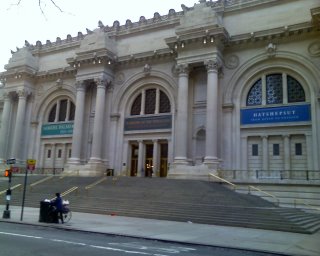
Metropolitan Museum removed the scaffolding that had obscured the front during its refurbishing. I was struck by how handsome the building was. Not only was it nice and clean, it was free of the huge banners they always used to advertise the current exhibitions. There were normally five banners, including three huge ones that sometimes flapped noisily in the breeze. I thought I wouldn't have very long to enjoy the sight of the unencumbered ediface before they hoisted some new ones.

But to my delight the big, distracting banners were replaced by three small ones, directly attached to the facade, covering only some plain wallspace. I guess I wasn't the only one who disliked the old mess.
Bravo, Metropolitan! Your building not only contains art, it
is art, and it should be seen in its glory to the utmost.
 But to my delight the big, distracting banners were replaced by three small ones, directly attached to the facade, covering only some plain wallspace. I guess I wasn't the only one who disliked the old mess.


No comments:
Post a Comment